
Having a mobile or responsive website simply means that your site is optimised for mobile use. Whether someone is browsing on their iPhone, a tablet or their Samsung, your website will automatically scale to fit different sized screens. This ensures that you provide a friendly user experience rather than a frustrating one.
Why do I need a mobile website?
If your customers are anything like the majority of the population, they’ll be utterly devoted to their mobile phone. On average, us Brits can’t go longer than a measly 12 minutes without checking our phones.
We log into Facebook an average of seven times a day and check WhatsApp a whopping 74 times. 64% of us admit that our phones distract us at work, 55% can’t eat a meal without sneaking a peek and 65% of us use our phones in bed knowing full well it affects the quality of our sleep.
Mobile phone use across the UK is extreme and it’s abundantly clear that if businesses want access to their customers, they need to cater to this.
Google has changed its ranking algorithms
Since its inception, Google and other search engines have indexed and ranked content based on desktop ranking signals. An obvious choice given that searches were primarily carried out using desktop computers.
Fast forward to 2015 and everything changed. This was the year that mobile phones overtook laptops as the most popular device for getting online. Naturally, Google had to do something about this so it started to change the way that it displayed mobile search results. Prioritising mobile-friendly sites, it meant that all of a sudden, websites that were optimised for mobile started to rank better than those that weren’t.
Even four years later, Google continues to favour this trend. In July 2018 it started to make the move towards swapping out its entire index to a mobile-first orientation. What this means is that from here onwards, Google will judge your desktop and mobile sites’ worthiness based on your mobile implementation. By now, most of us know that when Google recommends we do something, we really should do it.
It builds credibility
A mobile-friendly website can really help to build credibility with customers, clients and industry influencers. It ensures that anyone who visits will have a proper experience. This encourages them to see you as a credible resource for information, products and services – not just online, but offline as well.
We remember the websites we’ve had good and bad experiences with and if there’s one thing any business knows, it’s that reputation is everything.
Even if you offer some of the most useful and valuable products or services on the market, if your website’s mobile experience is poor or non-existent, your company will be a digital dinosaur – and people will go elsewhere.
You can reach more customers, faster
Making your website mobile-friendly automatically opens your customer base up to anyone performing a mobile search.
With responsive design, your website will render to look and function well, no matter what. This allows visitors to read your blogs, purchase your products or contact you at the click of a button without any obstacles.
Websites that aren’t mobile-friendly however, require the user to pinch or zoom in order to read the content. Most of us find this a frustrating experience and are likely to abandon the site as a result. One certainty is that most businesses can’t afford to give customers a bad experience – digital or otherwise.
Now you’re sold on the benefits of creating a mobile-friendly website, how do you go about executing it?
How to create a mobile-friendly website
The first thing you need to do is check whether or not your website is responsive to mobile. You can do this by simply looking at it on various mobile devices. You can also use mobiReady – a free tool which tests website performance across different devices.
If things aren’t looking too good, you have two options – you can design a mobile website yourself or you can outsource to a specialist. The obvious choice is to use whoever built your website in the first place. If you built your site yourself but need help making it mobile-friendly, do an online search for companies or individuals specialising in website design.
If you created your website yourself, most of the popular platforms include mobile-friendly templates. If you didn’t do this when you initially built your site, you can go in and do this now.
Whichever aspect of your mobile site you’re trying to reconfigure, you will be given a step-by-step guide on how to do so. In most cases templates will already be set up so all you need to do is choose your favourite one.
Aside from the design, there are a number of other improvements you can make to ensure that your website is as mobile-friendly as possible:
Don’t use Flash
Flash largely fell out of favour years ago because it can slow down a page’s load time and there are a lot of browsers and devices that don’t support it.
If you build a website that relies on Flash animation, you risk alienating a large percentage of your mobile users so it’s best to forget about it and find a design that works without it.
Adjust font and button sizes
Font and button sizes matter a lot for mobile devices. While it’s easy enough to click on a button of just about any size with a mouse, when you’re trying to click with your fingers on a small screen, buttons can be difficult to deal with. This is especially true if there are multiple small buttons close to each other – repeatedly pressing the wrong button will cause real annoyance for your visitors.
It might sound big but your font size should be at least 14px because this allows visitors to read your content without the need to zoom in.
When it comes to buttons, it’s a case of the bigger, the better. Apple’s design guidelines recommend a minimum of 44px by 44px because this reduces the chances of someone missing or hitting the wrong button by mistake.
Getting your font and button sizes right not only provides a better user experience, but it can also help to increase conversions on ecommerce sites.
Test site speed
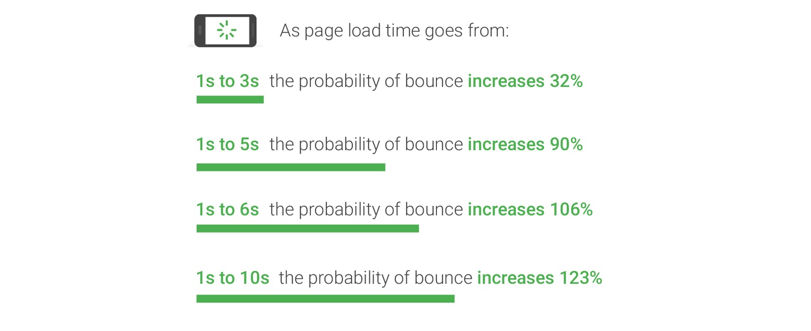
One of the most important aspects of creating a mobile-friendly website is site speed.
75% of people in the UK say that page load time has the most significant impact on their overall experience. Research from Think with Google also reveals the dramatic impact that page load time has on bounce rates.
If your website is slow to load, there are a number of ways you can fix this:
- Compress anything that takes up a lot of space such as images and your CSS
- Minimise HTTP requests
- Upgrade your hosting
- Reduce image sizes
- Prioritise above-the-fold content
- Reduce plugins
More information about all of these methods can be found here.
Allow users to switch to desktop view
Some of your mobile visitors may actually prefer to use the desktop version of your website. This is more often the case if you’re using a mobile version of your website rather than a responsive site. Give users an easy option to switch over so they can browse based on their personal preferences.
Carry out regular testing
The best thing you can do to provide a great mobile user experience is to test your website on a regular basis. Look at your site on your phone and tablet and spend some time browsing to see if anything’s hard to see or difficult to do. Ask your employees to do the same and consider hiring users to do testing as well because it can be beneficial to have a fresh set of eyes.
Even if you get everything right today, the way mobile devices look and operate is continually changing. Provided you continue to test and tweak and treat your mobile website as a priority however, you’ll be able to provide your visitors with a fantastic experience that’s going to ensure they return time and time again. Learn more about cross device behaviour here.