Author: Graham Charlton
Topic: Selling online
Time to read: 10 minutes
A well-designed ecommerce product page can make a big difference for online retailers. It’s a place where a lot of potential customers are considering a purchase and weighing up their options, so what they see and read on this page can sway them either way.
Product pages need to work hard to show products (or services) in the best light possible, but also to give customers all the information they may need to make an informed decision.
Here, I’ve listed the key elements that most retailers use on product pages. Some, like product images, are needed on any product page while others may vary in importance depending on the type of retailer and product.
Others may not be considered essential but are useful additions which may improve performance and persuade more customers to go on and buy.
Product name and price
Obvious but essential. Customers should be able to see the price quickly, as this is a big factor in the decision, while page titles should be H1s for the benefit of search engines.
The H1, or header 1, is the primary headline of a webpage, telling search engines exactly what the page is about, so they can index and rank it accurately for the right keywords.
For users, a clear H1 provides instant confirmation that they have landed on the correct product, which reduces bounce rates and improves the overall shopping experience.
Images
Product photos are vital for most ecommerce sites. They need to sell the product by showing it in its best light and allowing customers to understand the workings and features.
Multiple product images also help to show products from different angles and give the customer a full view of the product and its features.
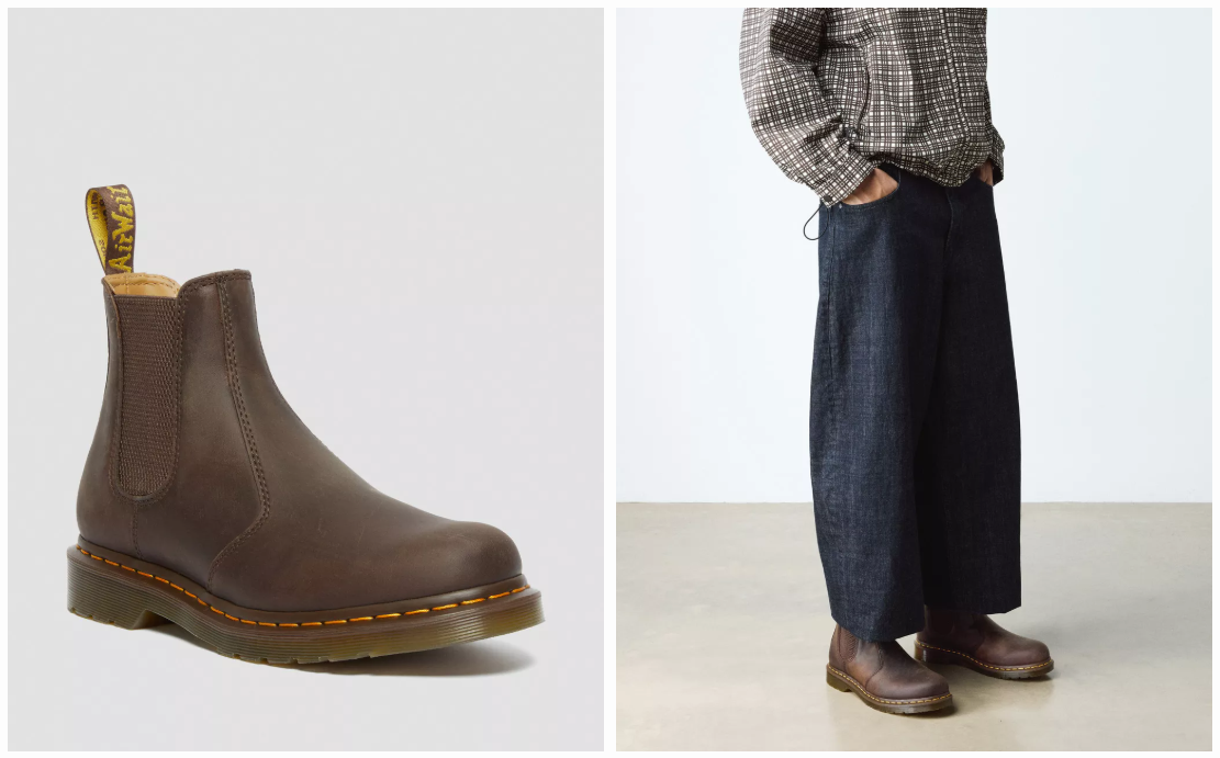
For example, a retailer selling shoes can show images which allow customers to see them from every angle, so they get a detailed impression of what they look like. Here, Dr Martens displays a range of images alongside gifs showing the boots on a model.
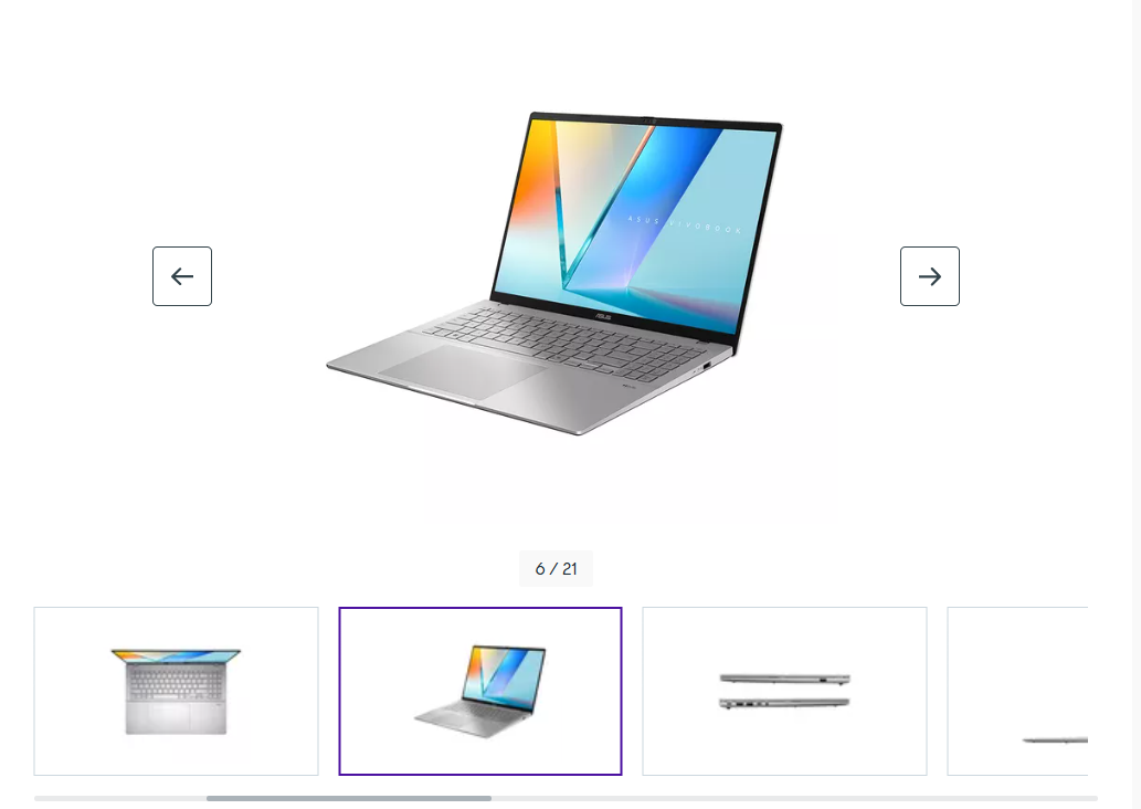
Images can also help to convey key information about product features. For example, these images of a laptop show the number and types of ports on the machine, keyboard layout, and so on.
Images should also be high quality where appropriate, so customers can see details like quality of fabric and texture, especially for more expensive items.
Calls to action
Calls to action like ‘add to basket’ and ‘buy now’ buttons should be prominent and easy to spot so customers know what they need to do to make a purchase.
Lots of sites use colour and contrast, as well as button size and shape to help them stand out from the page. Many, for example, use green buttons but there’s no right or wrong answer here – it’s about the combination that performs best.
This can be tested to find the best performing button, but I think a common theme is that they contrast from other page elements, making them easy to spot.
Mobile-friendliness
With mobile share of ecommerce sales at 60%, mobile optimisation for product pages is essential.
Buttons, images, and calls to action should all be easy to tap and view on a small screen. If your site isn’t already using a responsive design that automatically adapts to any screen size, this should be a priority.
You can easily test mobile optimisation using Google’s PageSpeed Insights tool which flags interactive elements that are too small or slow to load on mobile devices.
Complementing this, a manual test using your own mobile can ensure that critical buttons like ‘Add to Basket’ are physically reachable and that pop-ups don’t block the user’s path.
Together, these methods confirm that your site is both technically optimised for Google’s algorithms and practically usable for customers shopping on their mobiles.
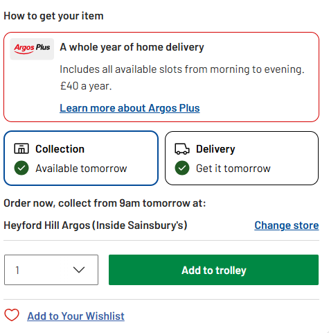
Delivery options (or links to them)
Delivery is a key part of the proposition, and while customers are deciding on a product, they may also like to know how much delivery costs and how long it will take.
There can be a lot of delivery options, so this can always be displayed prominently on product pages, but a quick summary and a link to more detailed information is a good way to ensure that people can find the information they need.
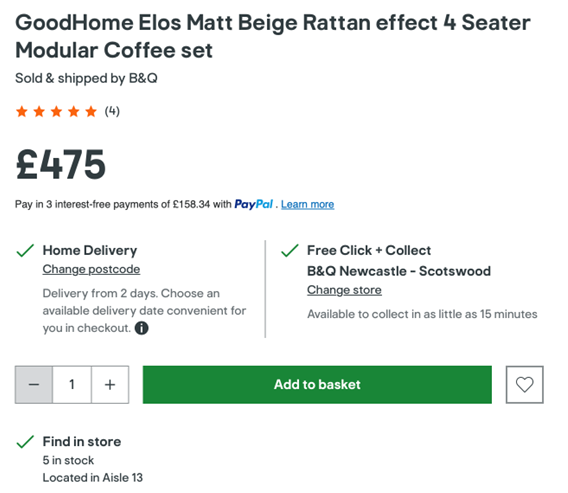
Here, B&Q displays a quick summary of delivery options, as well as click and collect availability to help customers assess options instantly.
Returns policies
Like delivery, this can be a key factor in a customer’s decision to buy, so many will want to see some reassurance.
For fashion brands, highlighting easy returns policies can be a way to reassure customers that they can buy without worrying about whether they will have any hassle if the products aren’t quite right for them.
Product description
The copy used here should be informative, and work to sell the benefits of products. The lengths your copy needs to go to sell will depend on the product. For an expensive or complex product, you may need to work hard to sell it, while for simple products a brief description will suffice.
It’s important for the copy to be original, and not just the standard manufacturer’s description pasted onto the page. Original copy is better from an SEO perspective but can also be more effective.
It should be easy to read (and to scan quickly) and sell the key benefits of your product or service.
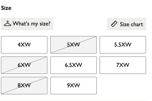
Stock availability
While some products are either in stock or not, customers need to see information on availability.
It’s also important where customers may be looking to research products online but pick them up in store. For example, Argos allows you to search by postcode, so you can check stock in local stores, as well as availability for delivery.
It’s also important where there are variations of a product that might not be in stock; shoes and clothing being an obvious example.
Here, John Lewis puts a line through sold out sizes and colors.
Another option for stock availability is to give customers the option to submit their email address for back in stock notifications.
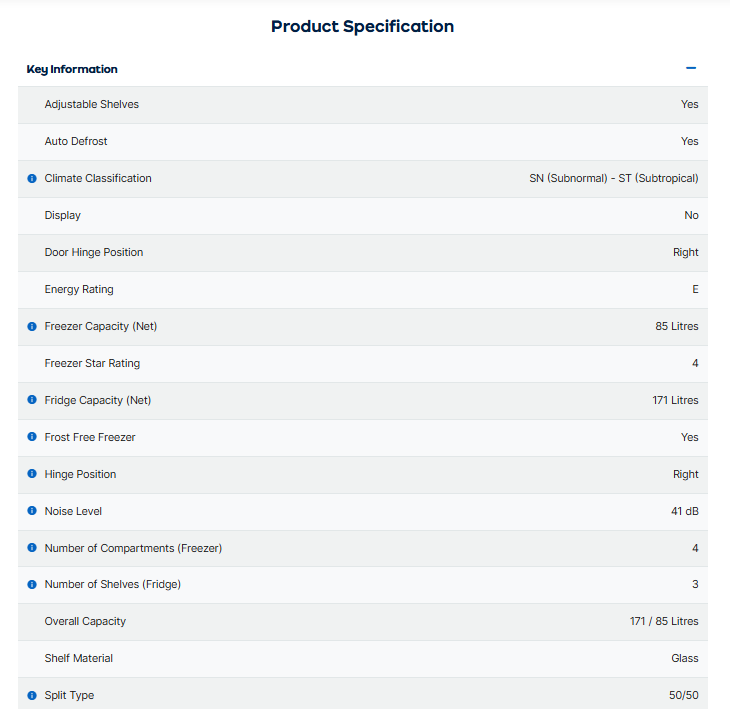
Product details
These can be mentioned in product copy, and this may be a better approach for simple items. For example, you can mention materials used when writing copy for clothing product pages.
However, for some products, it’s necessary to go into detail to show specifications, and it’s best to lay this out in a way that’s easy to digest and understand.
Technical details and product features can be lengthy to list, so it’s important to think about readability here.
This product page for a fridge-freezer lists all the relevant data but puts this into a list that is easy to read and scan down. Some shoppers will read all the details, while others just want a few key points, so picking out a few of the key features and setting them out clearly is a great idea.
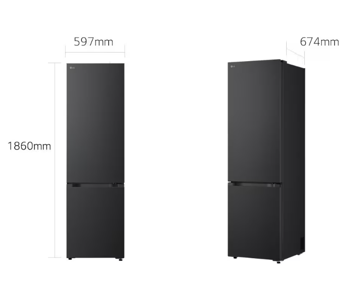
It’s also good to consider different ways in which product details can be conveyed. For example, this diagram shows the various fridge measurements in a way that’s very easy to understand.
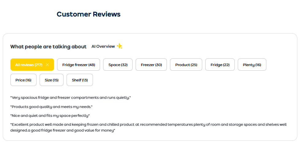
Customer reviews
According to a 2025 survey of more than 21,000 consumers, 95% regularly read product reviews as part of their shopping journey, making them an essential feature on product pages.
For smaller businesses, it can be hard to gather a significant volume of reviews from customers, but it’s worth making an effort here, as they’re so important for driving sales.
For example, you can send customers an email a short time after purchase asking them to review items. It may even be worth offering incentives like discounts on future orders.
Once you have reviews, it’s good to think about how to display them on product pages. For one, an average review rating accompanied by the number of reviews is a great piece of information to place prominently on a product page.
The details of the product review can then be placed further down so that the most prominent areas of the page can still be used to show product images, prices, and key product copy.
Many sites will simply show the review score and the text of the review, and this works perfectly well. If you want to go further, sites like AO.com are a great example of how to use the data from reviews to give a fuller picture of products.
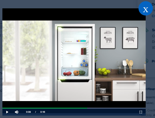
Videos
Video isn’t necessarily a must-have on every product page, but it can work very well in the right context.
Videos can quickly convert product information into a format which is faster and simpler for shoppers. Back to fridge-freezers, this video demonstrates the product and explains key features in less than two minutes.
Contact options
Contact options can be shown for a couple of reasons. Firstly, to reassure customers that may be using a site for the first time, but also to offer assistance when customers have questions about the product or purchase.
For example, if a product or purchase is complex for some, then offering a live chat option, a chatbot, or showing a clear contact number on your product page can give the customer a way to have any queries answered.
Social proof
Social proof is about encouraging customers to buy and offering reassurance by showing that others have bought from your site and been happy with their purchase.
It can come in the form of reviews, but there are other ways to use social proof. For example, many sites (hotels and travel sites especially) show how many times a purchase has been made.
Using this example, this tells the customer that other people are happily booking the hotel, which offers some reassurance. It also tells them that it’s popular so maybe they need to book quickly to avoid missing out.
Other examples of social proof would be photos of customers using or wearing products or showing the number of social shares or ‘likes’ on the page.
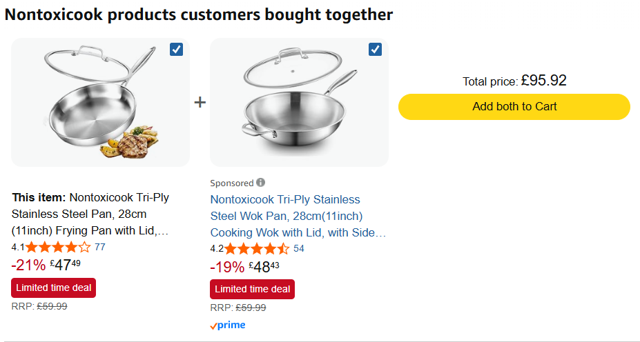
Cross selling options
These are common to most product pages and can help retailers to increase order values by showing products that are related to or complementary to the product.
One obvious example would be to show accessories for a particular product. Here, Amazon shows related cookware and a bundle with savings.
April 2026.
For fashion sites, offering clothes that go well with the product viewed and ‘complete the look’ is a great way to cross-sell.
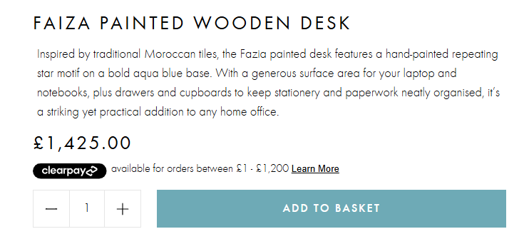
Payment options
This is an optional feature, but in some cases, highlighting a specific payment option can be persuasive.
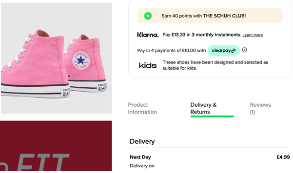
Here, for example, Graham & Green highlights the Clearpay option which allows shoppers to pay over time. Other sites may highlight their own finance options, or similar payment methods such as PayPal Credit or Klarna.
Other options for ecommerce product pages
Most of the 15 features I’ve listed already are essential or at least very good to have, but there are other options to consider:
- User Q&As. A good way to get key product questions answered by other consumers.
- Show prices with and without VAT. More for B2B sites, but useful information for shoppers.
- Highlight special offers. If you have a discount running on an item, make sure it’s visible on the page.
- Add to wishlist. Allow people to create a list which they can come back to later.
- Recently viewed products. Remind customers of the items they’ve been looking at.
A note on SEO for ecommerce product pages
Good SEO for ecommerce product pages doesn’t require a separate strategy. Many of the features on this list are useful for two reasons; they help convert customers and help your pages rank higher in search results.
- Product name as H1. Using your product name as an H1 heading tells search engines what the page is about. Including relevant keywords in this heading based on the terms customers actually search for improves your chances of appearing in results.
- Original product descriptions. Search engines reward detailed, useful product descriptions, and they can penalise duplicate content. Writing your own copy (rather than using manufacturer descriptions) can help your pages rank and stand out.
- Customer reviews. Reviews are a powerful SEO asset. Star ratings and review content can enable rich snippets, those eye-catching star ratings that appear directly in Google search results, which improve click-through rates and drive more traffic to your pages. Reviews also add fresh, keyword-rich content to your pages over time.
- Product images with alt text. Adding descriptive alt text to your product images helps search engines understand what they show and can drive traffic through Google Image Search.
- Structured data (schema markup). Product schema markup helps search engines recognise your page as a product page, boosting ranking potential and making it more likely to show rich snippets including price, availability, and ratings directly in search results. Many ecommerce platforms (like Shopify and WooCommerce) handle this automatically, but it’s worth checking.
- Page speed. A fast-loading page is better for users and better for SEO. Google uses page speed as a ranking signal, particularly on mobile.
Summary
A great ecommerce product page is your most important online sales tool. By combining high-quality images, clear pricing, honest reviews, and useful delivery and returns information, you give customers everything they need to buy with confidence.
The added benefit is that many of these elements can help your pages perform better in search results, bringing more potential customers to your site in the first place.
It’s worth reviewing your product pages regularly, as customer expectations evolve, and small improvements can make a real difference to conversion.