

 Login
Login
Author: Graham Charlton

Topic: Web Design
Time to read: 10 minutes
When visitors arrive at your website, in most cases you’ll want to encourage them to look around and view multiple pages.
This may be encouraging them to browse and find products they’re interested in buying or simply helping them to find out more about your products or services.
This is why easy and effective navigation matters. It enables your users to find what they are looking for, or to discover interesting pages and content as easily as possible.
Good UX (User Experience) matters here, as hard to find information and unclear navigation causes frustration, which can lead to people simply abandoning your site and looking elsewhere.
Essentially, good navigation, as with good UX in general, reduces friction, which makes it more likely that visitors complete whatever action you want them to take, whether that’s making a purchase, donating, booking, or simply finding information.
Conversely, poor navigation doesn’t just lose a visitor once. It can lose them permanently. Users are typically intolerant of poor user experience, and if your site doesn’t provide a reasonable experience, they’ll find a competitor that does.
Navigation also affects how well your site performs in search engines. Google discovers and indexes your pages by following links. A clear, logical navigation structure makes it easier for Google to find all of your content.
Pages that aren’t reachable through your navigation may never be indexed at all, meaning they won’t appear in search results. A well-structured site also helps Google understand which pages are most important, which can improve rankings. This applies to any type of site.
In this article, I’ll look at why navigation matters, share some website navigation best practices to consider, and give examples of how different types of sites approach it.
What is website navigation?
Website navigation is the information and links you provide to guide visitors to different pages of your website. It’s the signposts that tell people how to get from one area of the site to another.
It can be a navigation menu at the top of a page which provides links to different sections of the site. It can also be the links within a booking form or checkout process, which direct users through the different stages and make it clear how they need to proceed to complete a booking or make a purchase.
Why is navigation important on a website?
Website navigation is one of the key factors affecting the user experience on a site. If people can’t find what they want on a site or can’t move from page to page easily, this is a poor experience.
It’s also one which will affect your business. If customers arrive with the intention of making a purchase or booking and can’t find what they want due to poor navigation, this can have a negative impact on business revenues.
Also, most website visitors will move around your site using navigational links. Some may use site search, but that’s likely to be a small percentage for most sites, which means the vast majority are using links to move around.
If website navigation feels easy and intuitive to the user, this helps to create a more pleasing on-site experience. It saves them time wasted trying to second guess the site to find things and makes it much more likely that visits will end up in conversions. For example, the navigation on a desktop website will sometimes present more options to the visitor, while mobile sites tend to hide or slim down options to save space.
Website navigation examples
Main navigation bar
This is the most common way to present navigation options, especially on a site’s homepage.
The example below shows the main navigation on the Sky News website. It’s a site with thousands of articles, and lots of separate topics, so it needs to help people find the section they want.
Whether for an ecommerce site, a media site or a local business site, it can make sense to follow convention as visitors will know where to look and how to use this style of navigation.

The point of a menu like this is that it allows people to browse the site in a number of ways to cater for different interests and preferences.
From a business perspective, the choice and ordering of options is important here as it can drive traffic to the areas of the site you want to promote and give them greater prominence in the navigation.
The choice of these options can also be data driven. For example, you may spot that certain pages are more effective in driving leads and conversions and decide to put these in your main navigation to make them easier to find.
Another benefit of the main navigation bar is that it can easily be used across the site, allowing people to navigate from wherever they happen to land on the website.
Sidebar navigation
For main navigation, the top bar is generally more useful than side bars for ecommerce sites. However, sidebars can be useful on some sites and for some ecommerce navigation.
Sidebar menus can be useful for presenting longer lists of navigation options which simply wouldn’t fit horizontally without being untidy or too complex.
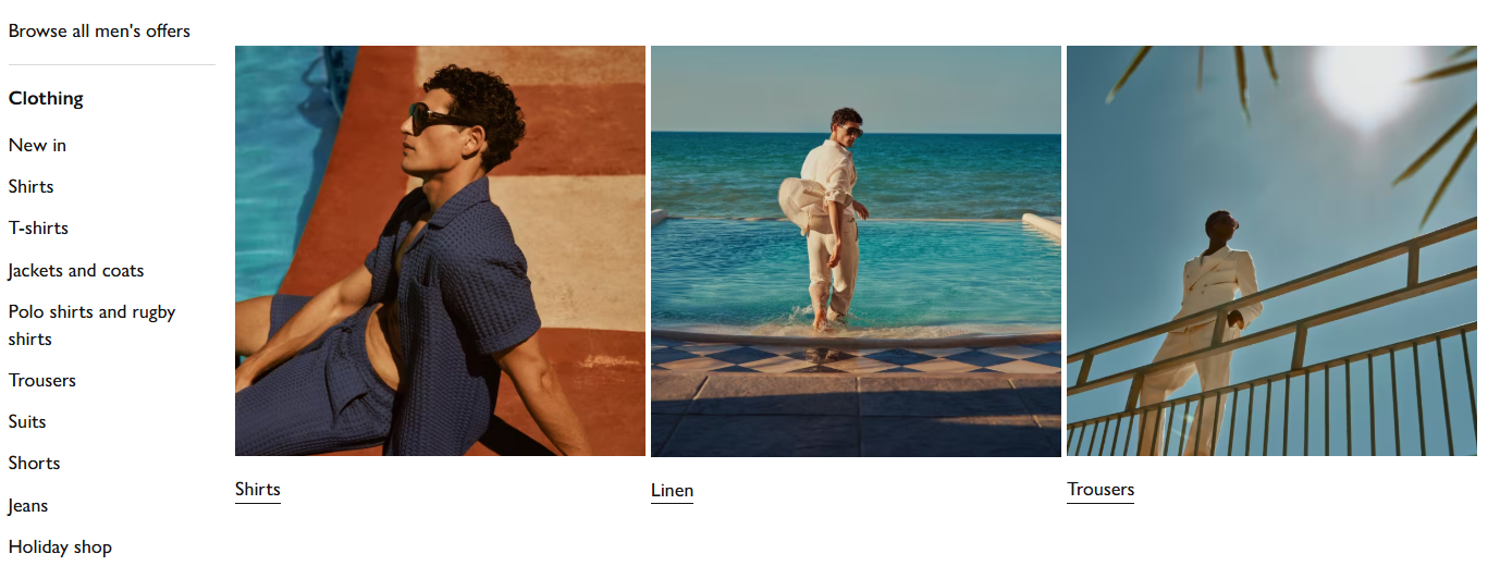
On ecommerce sites, sidebars can be useful for this reason, especially in areas such as secondary navigation. This is the page you reach after clicking on one of the options from the main navigation bar, ‘Men’s clothing’ on John Lewis in the case below.
By presenting the options vertically in the sidebar, John Lewis can present its 50+ options in a way that’s easier to view and use.
Drop down menus
Drop down menus are another form of secondary navigation which help websites to present multiple navigation options to users. They are useful to present a quick overview of a company’s products and services in one single view and can help to speed up navigation for users.
The key here is to present options in an organised way so users can take all the choices in, splitting it into clearly labelled sub-categories and using icons to catch the user’s eye.
Footer navigation
Footer menus have a specific function on most sites. Commonly, they are there to present options that some users will want, but that don’t need to be as prominent.
This includes options such as links to customer service contact options, account logins, terms and conditions, or careers and ‘about us’ pages.
Links to some of these options should be presented outside the footer too. A B2B vendor for example will have a prominent contact / book a call button on the homepage as well as in the footer.
Hamburger menus
Hamburger menus are used by many sites for mobile, as they save space on a smaller screen.
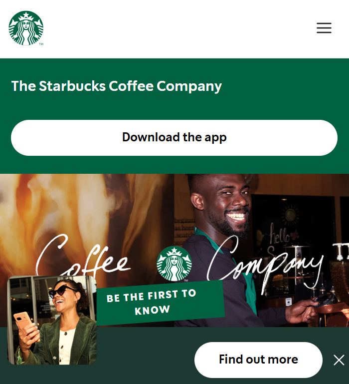
However, there has been some criticism of hamburger menus. For example, research suggests that hamburger menus can be worse from a UX perspective as they make content less discoverable.
Research from NNG confirms that the hamburger icon is now widely recognised by users but suggests several best practices: use it only when screen space genuinely requires it, place it in the top-left corner, and add a text label where possible.
It recommends that, if your site has just four main categories, then these are better presented as links than hidden behind a hamburger menu.
NNG’s guidance is clear that the hamburger menu is not appropriate for desktop websites. Navigation does more than help people move around a site; it also helps them understand what a site contains, and hiding it removes those cues entirely.
Matching navigation choice to your site
For different types of sites, navigational priorities change, and it’s important to match navigational styles and options for user habits as well as business priorities.
Blog navigation
Rather than directing people to products, the goal is to help readers discover more content. Categories, tags, and ‘related posts’ links serve the same function as a retailer’s department structure, helping people find what interests them and encouraging them to stay on the site longer.
Charity and non-profit sites
Priorities are different again here, where the focus should be on getting visitors quickly to the actions that matter most, whether that’s donating, volunteering, or accessing services.
A Donate button should be prominent in the main navigation on every page, not buried in a menu.

As a general principle, the smaller the site, the simpler the navigation. So, for personal websites, local businesses, and charities, navigation doesn’t need to be complex.
A top bar with four or five clearly labelled links often works better than a large dropdown structure. Simplicity is a feature, not a limitation.
Or, if the site has almost a single purpose, make it clear. There can be more options as you scroll, but if for example booking is the primary purpose, it can make sense not to distract from this with lots of different navigational links displayed.
Best practices to consider for website navigation
Whichever navigational method your site has, it’s important to think about some key best practices.
Use clear headings
Labelling is important with navigation, as users typically scan information on a webpage quickly. Language and text should be clear and designed to avoid confusion.
NNG’s research on navigation labels found that vague wording, unnecessary phrasing, and overly conversational labels all reduce what they call ‘information scent’ and make it harder to understand.
Labels like ‘Solutions’, ‘Things we do’, or ‘Find out more’ are weaker than specific, descriptive labels like ‘Services’, ‘Pricing’, or ‘Contact us’. This applies equally to a small business, charity, or blog.
Follow convention with navigation
There’s no need to reinvent the wheel with web navigation. As Jakob Nielsen once said, “users spend most of their time on other peoples’ sites, so they expect yours to work the same way.”
In the case of navigation, this means they’ll look for navigational links where they are used to seeing them. This means using a top bar for the most important links and using sidebars and drop downs to present secondary navigation.
Think about your website navigation structure
If you’re creating navigation from scratch or improving current navigation, think about the structure of your site.
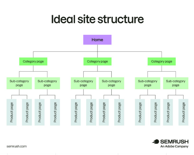
The diagram below from SEMrush shows an ideal navigation structure, which is a hierarchy that makes logical sense. Your homepage is at the top, followed by main category pages, then subcategories, and finally individual pages.
Logical navigation like this makes sense and is predictable to users, while following this structure with internal linking throughout also works well from an SEO perspective, as it makes your site easier for search engines to crawl.
Add clear space between navigation links for mobile
Navigation needs to take account of mobile users, and one key factor is making navigational links easy to select without user error. Space links apart so that they can be selected easily by touchscreen users to avoid user error.
Make sure menus stand out from the background
If a site design is busy and colourful, menus won’t always stand out. Make sure they can be seen easily by using font size or colour. A little background shading or colour contrast can help the menu options stand out against the rest of the page.
Navigation should work alongside business goals
While it’s important to consider UX at all times, navigation can also be used to direct visitors towards your most important pages.
These may be your most popular products or perhaps a page for requesting a quote or making a booking or even pages which convert well.
Use data to find your best performing pages and make them easy for users to find.
Breadcrumbs
Breadcrumbs are a secondary navigation aid that show users where they are within a site’s structure (e.g. Home > Services > Web Design).
They’re particularly useful on larger sites with multiple levels, help users navigate back without using the browser’s back button, and have an SEO benefit, as Google displays breadcrumbs in search results, which can improve click-through rates.
Accessibility
Navigation should work for all users, including those who navigate by keyboard rather than mouse, and those using screen readers. This means using standard HTML navigation elements, ensuring keyboard focus is visible, and providing clear labels for all navigation links. This is also increasingly a legal consideration in the UK, with more than 16m disabled users and many websites failing on basic accessibility principles.
In summary
I think the key theme here is to make website navigation as obvious and easy to use as possible.
It’s about clarity of links and language and clear placement of navigation menus so that users can find them with minimal effort.
Good navigation improves the user experience on your site and helps users find what they’re looking for, whether that’s a product, a service, information, or a way to get involved. This benefits users, and a clear structure also helps Google to crawl and index your site more effectively.
Please note: The examples shown here are for illustrative purposes only. Nominet is not endorsing the companies or products shown.